I was given the opportunity to work on was a set of 12 icons for The Unextinction Foundation. These are for a non-profit organization to gain signatures to bring back the Dinosaurs! They contacted me about icons to put on their website but also build a brand out of. They wanted some sort of paleontology style icons. They wanted cohesive icons that they could put on shirt, bags, bracelets, and on their website.
The Clients initially wanted a paleontology theme; shovel, brush, fossils, skull, hammer, and items like that. The icons had to be investigative, artistic, and conventional.
First Set of Sketches


With my first set of sketches I made a list of words that I thought encased what a paleontologist is, and then I went more into depth with a few words and created sketches for them.
Draft for The Unextinction Foundation

I wasn’t happy with these icons and neither was my client. We had both decided that they look unorganized and sloppy. There are too many little lines and details. We had decided that we needed to pick one thing and then make different variations of that one thing. With the feedback I was given, it was back to the drawing board for the 2nd round of sketches.
Second Set of Sketches


With these sketches I really got the push I needed to create some great icons, While creating them I still had some small details to work out which I will show you below.
Phases of the Icons


I first had to decide from thick lines with no shadows or no line and shadows. I also then had to decided if I wanted teeth or no teeth, I had to decide if teeth would add or subtract from the actual icons.

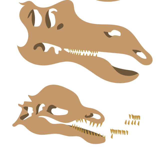

After a lot of debate I had decided that teeth added way more to the icons than without them. I also added shadows but a little bit more odd shapes so that it wouldn’t be to uniformed. I could really see it coming to life.
Final Design for The Unextinction Foundation

Here is the final 12 icons, These follow the requirements because they are organized, cohesive, artistic, conventional, and investigative. All of these Icons fit well on any design they might want to create as well as on their website, Check out how they chose to style them.

Overall, I have really enjoyed this project and the ability to create Icons for this non-profit organization.
If you would like to learn how to make your own Icons click here to learn how.