Watch Project
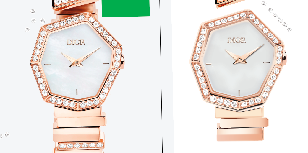
This project was a huge task, a different and weird project that I was so glad I was able to do my best to execute the task. My client wanted me to recreate a photograph of a watch for her website so that she could use it as a graphic instead of just a photograph.
She wanted me to create a unique and strong looking watch, that stood out against all the other watches. I was looking at a bunch of different watches and came across this beautiful odd shaped Dior watch. So of course like all my other projects I started with sketches.
Sketches of Watches
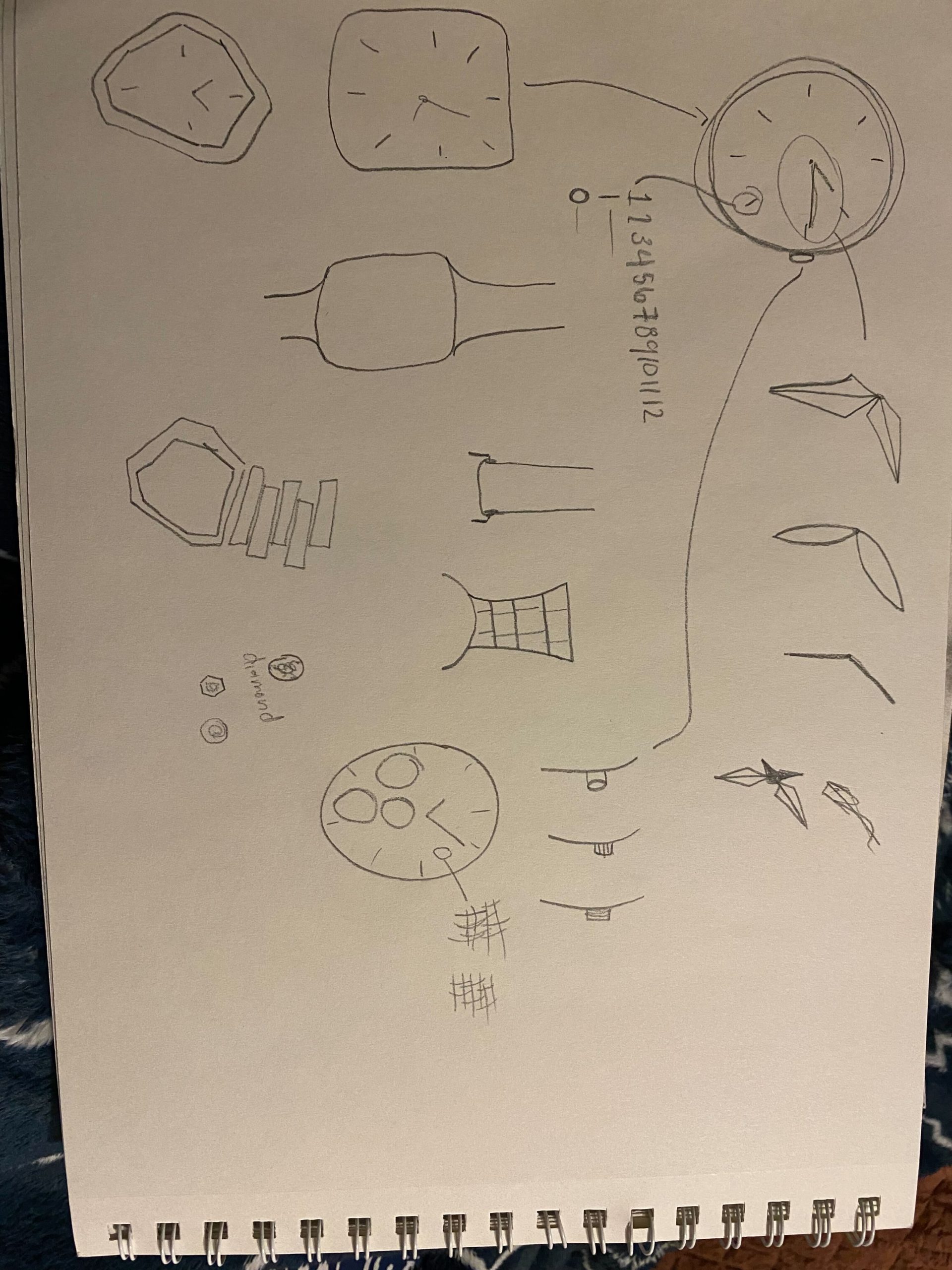
I was having a hard time with the sketches because I feel like most of watches all look the same, with little differences. When I found my unique watch it was a lot of fun to figure out all the other ways to draw a watch. With these sketches I was able to start my journey through adobe illustrator I inserted the original photographic next to my draft to set up guidelines and little details to figure out the exact way to accomplish this.
Evolution of Drafts
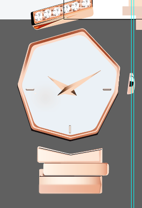
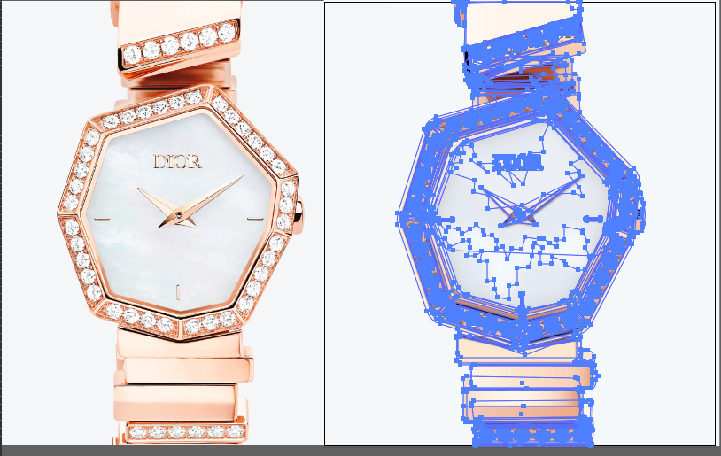
You can slowly see how to watch pieces are starting to just fall into place, At first I just wanted to figure out the basic shapes of the watch since it is so unique, then I started going in on small sections and and making each piece unique and realistic.
I was given a lot of really great feedback, on how to shade and add the right colors to my watch. Also how far to go down on the watch band. Through my feedback I created my final draft.
Final Watch
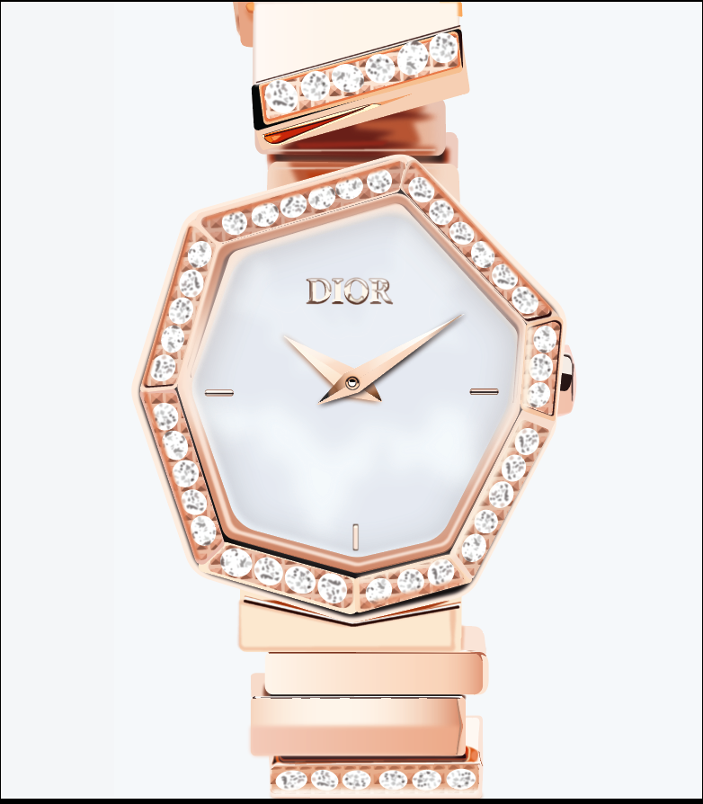
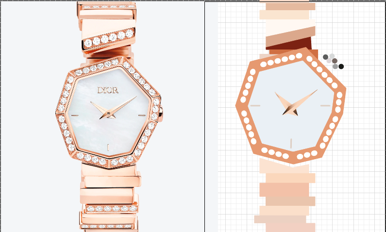
This is my final watch, I learned so much while doing this project. It was tough and mind boggling trying to figure out highlights and shadows. Every time I would look at the original image it would look more and more like a vector, I started seeing shapes instead of lines. Overall I had a lot of fun figuring out how to do this realistic vector graphic.
This watch is unique and strong, It 100% stands out against other watches. I have never seen a watch like this before.
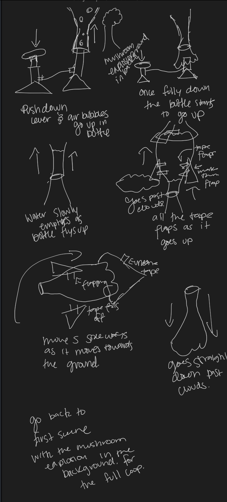
Bottle Rocket Animation
My client reached out to me after seeing the stickers I had just made and asked me if I could take to bottle rocket and make a looping animation of it going off. He is throwing a bottle rocket competition and wanted a cool eye catching animation to go alone with his mobile flyers. He asked for it to be exciting and different.
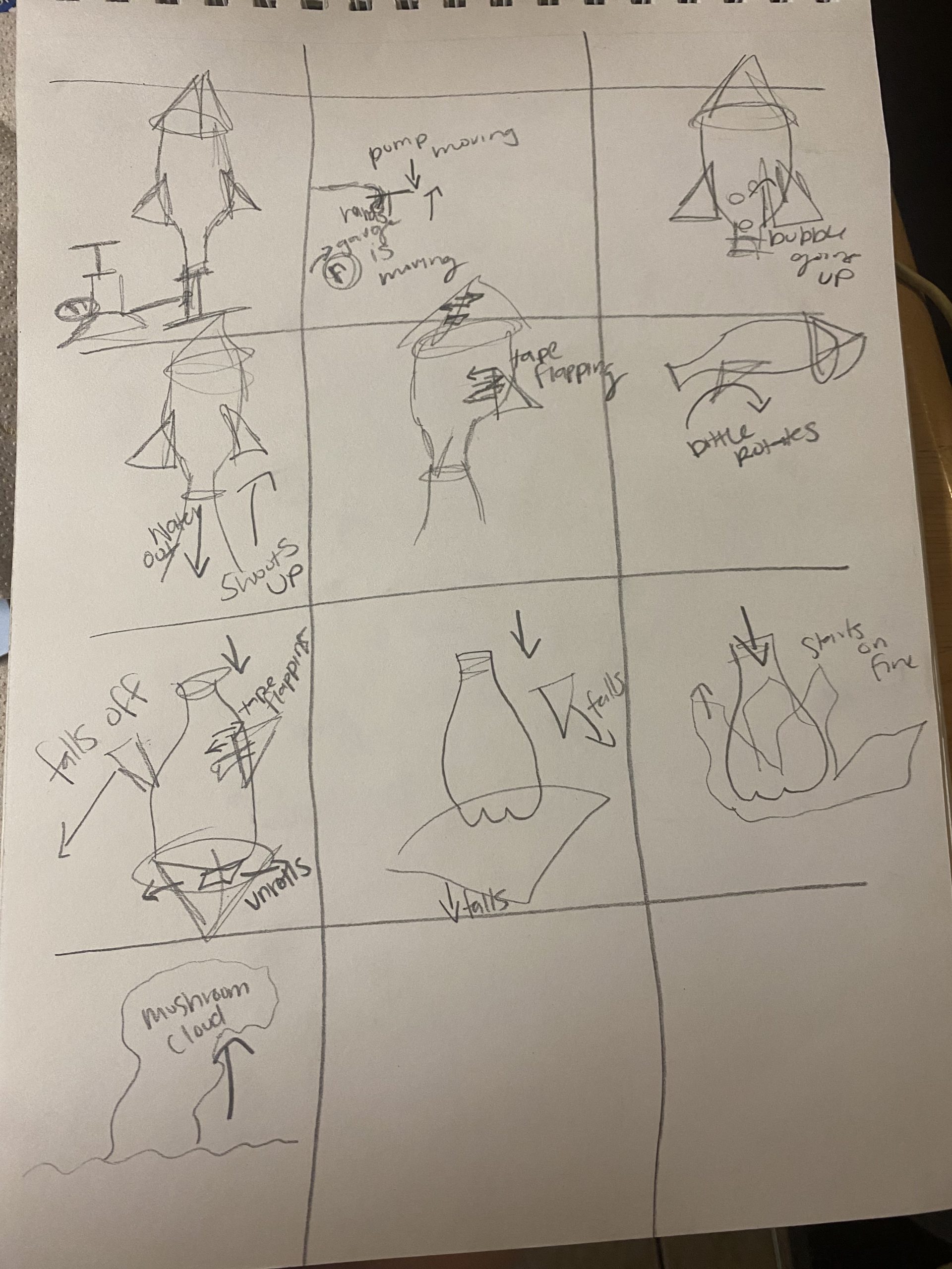
Sketches
For these sketches I decided to do more of a story bored and show how I wanted everything to move. I wanted it to tell a story and to be dramatic. After sketching this I also sketch on my iPad to make more of a simple story board.
Bottle Rocket Draft
I got a lot of good feedback on this rough draft. I learned that I should ease into transitions and use scale or opacity instead of just ending the clip. I also learned that this is the concept that he wanted just executed better. I felt like I was in a good standing with this draft.
Final Animation
This animation was a lot of fun to create and it was a lot of fun to learn a new skill. This animation has a fun twist on bottle rockets because it is showing them blowing up into a mushroom cloud in the end. I think it is unique in the way that it is executed. My client really likes it and is excited to use it to announce their competition.
You can also watch this animation on YouTube here
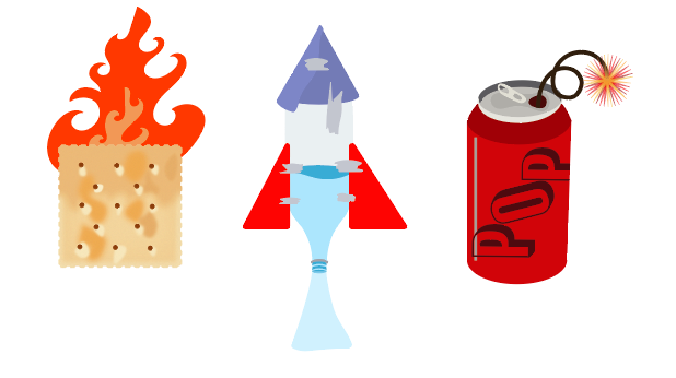
4th of July Stickers
My clients birthday is on the 4th of July and she really wanted some stickers to give out on her birthday. She was telling me how she wants them to be funny or punny. She would like them to be a set and to have a story to tell. Overall she just really wanted stickers that were fun to give out to her friend at her birthday bash.
Sketches

These are my sketches which I scrapped for my rough draft design. I thought that a punny set of stickers could be a “bottle-rocket” firework, “firecracker”, and a “bomb pop” Popsicle. I didn’t create sketches for my drafts and I think that is why I am not the biggest fan of them.
Rough Draft of the 4th of July Stickers

The three that look like they belong together was my rough draft I thought they were very patriotic and cohesive. When I reviewed them with my client she said that they were very basic and needed a little umph or funny aspect. That is when I made that cracker to develop the stickers I have now. With her feedback I went back to my original sketches to make them reality.
Final Design
These are my punny final 4th of July stickers that I am very proud of. They are very much more the personality of my client. They have a deeper meaning that is allowing people to figure out what they mean or be pleasantly surprised when they ask the owner. They are also a nice set that can be used together or separate.
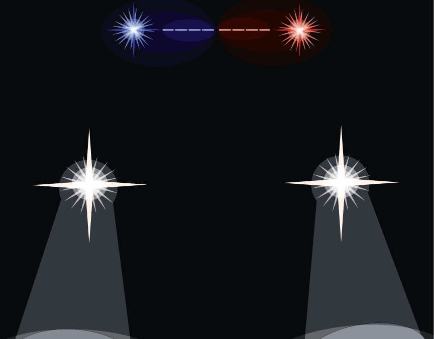
The Dead Dogs Band
When the band manager at the Dead Dogs Band reached out to me to make them a gig poster I was so excited. They wanted a poster that showcased their music but was also a little mysterious. He had said that he wanted it to seem exclusive but be open to anyone who comes. The main objective of this gig poster was to let people know that they were performing and to show up for the night of their lives.
Sketches


I had a couple of different concepts here, I wasn’t quite sure how I was going to accomplish there task, I created two different styles one 70’s theme, and one fantasy theme. I wasn’t quite sure these were right and you will see later down that I had to change all my sketches to really capture what the band wanted.
First Draft


After showing these rough drafts to my client we really went over what he was trying to accomplish with the gig poster. None of these were it, he wanted a poster that wasn’t directly related to the name of the band and also wanted something that portrayed a message without being bam in your face. With this critique I was able to make another sketch and see if it was what he wanted.
Second Sketches

With this sketch I was confident that we were on to something good, something that was going to be exactly what my client was looking for.
Final Dead Dogs Poster

With this new poster it is mysterious and seems exclusive. The cop car in the poster adds a bit of chaotic energy causing you to wonder what is going down at their gig. With the location and all that information being close to the background color it also adds this mysterious level to the gig. Overall my client was happy with the poster and so was I.
Check out my other work here.
To learn more about making a gig posters click here.
The Unextinction Foundation
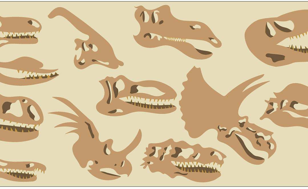
I was given the opportunity to work on was a set of 12 icons for The Unextinction Foundation. These are for a non-profit organization to gain signatures to bring back the Dinosaurs! They contacted me about icons to put on their website but also build a brand out of. They wanted some sort of paleontology style icons. They wanted cohesive icons that they could put on shirt, bags, bracelets, and on their website.
The Clients initially wanted a paleontology theme; shovel, brush, fossils, skull, hammer, and items like that. The icons had to be investigative, artistic, and conventional.
First Set of Sketches


With my first set of sketches I made a list of words that I thought encased what a paleontologist is, and then I went more into depth with a few words and created sketches for them.
Draft for The Unextinction Foundation

I wasn’t happy with these icons and neither was my client. We had both decided that they look unorganized and sloppy. There are too many little lines and details. We had decided that we needed to pick one thing and then make different variations of that one thing. With the feedback I was given, it was back to the drawing board for the 2nd round of sketches.
Second Set of Sketches


With these sketches I really got the push I needed to create some great icons, While creating them I still had some small details to work out which I will show you below.
Phases of the Icons


I first had to decide from thick lines with no shadows or no line and shadows. I also then had to decided if I wanted teeth or no teeth, I had to decide if teeth would add or subtract from the actual icons.

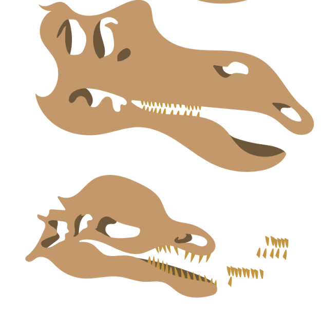

After a lot of debate I had decided that teeth added way more to the icons than without them. I also added shadows but a little bit more odd shapes so that it wouldn’t be to uniformed. I could really see it coming to life.
Final Design for The Unextinction Foundation

Here is the final 12 icons, These follow the requirements because they are organized, cohesive, artistic, conventional, and investigative. All of these Icons fit well on any design they might want to create as well as on their website, Check out how they chose to style them.

Overall, I have really enjoyed this project and the ability to create Icons for this non-profit organization.
If you would like to learn how to make your own Icons click here to learn how.
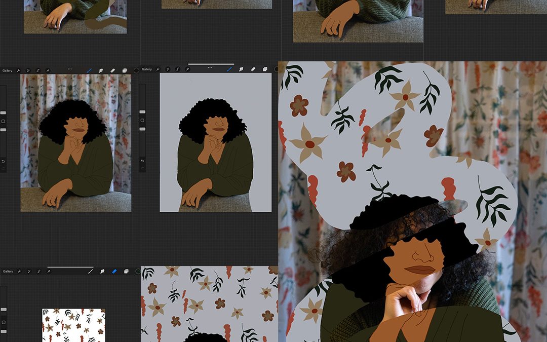
Mixed-Media Portraits
Mixed-Media Portraits
For my Mixed-Media Portraits, I wanted to mix together my two favorite creative outlets. I have always had a love for painting and creating my own pieces. I have recently discovered my love for photography. I have also wanted to figure out how to use procreate since so many people talk about how much they love it. I also wanted to prove to myself that I am still a good artist and can accomplish anything I set my mind to. If you have ever had a project that you wanted to accomplish I think today is the day you start it.

Digital Edits
I really wanted to learn how to use procreate and all the cool features it has. I have always seen these really amazing drawings and illustrations that people have done on procreate. After the first couple of hours of trying to figure it out, I wanted to give up and just use Illustrator because that was what I knew how to do.
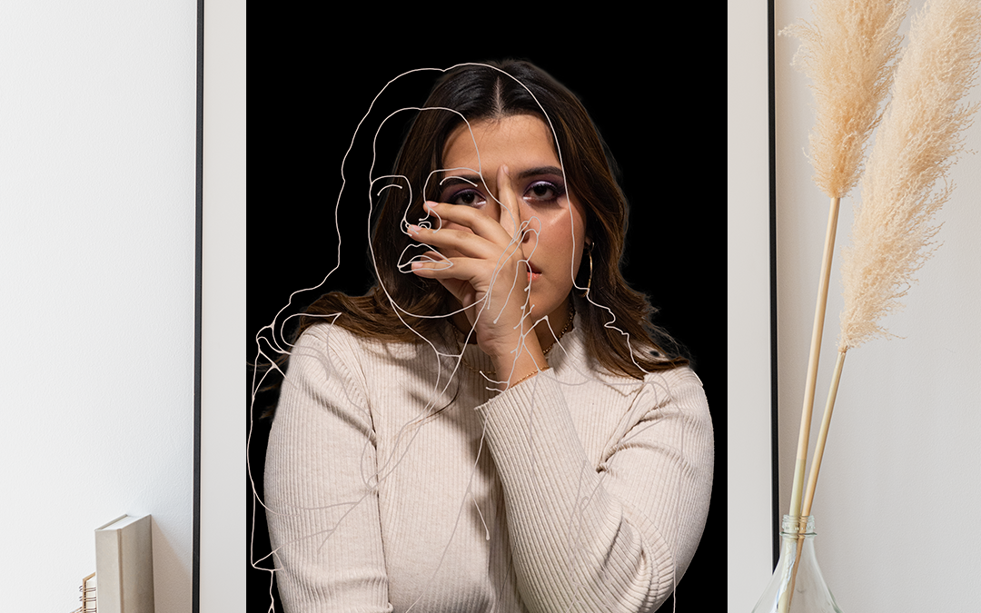
After I figured out how to use procreate, I was able to accomplish some of the ideas I had in my head. I really loved the swirly patterns or illustrations over the original photos. I played with using the original colors and then brighter colors. I honestly like the brighter colored ones more than the original colors.
I also wanted to play with two photos. I used a photo where her face was turned a different way and then layered it over a moodier photo. Overall I love procreate, and I am excited to keep using it and learning more about it.


Physical Edits
Like I said earlier, I absolutely love painting; I grew up painting with oil, and it is one of the only mediums I know how to use. When I ordered my photos, I ordered them on unstretched canvas material. But when they arrived, they were on photo paper, which I had no idea how to paint on. I had emailed the company, and they wouldn’t be able to send me the correct ones until I returned the wrong ones and which was going to take a couple of weeks to arrive. I obviously didn’t have that kind of time.
So after I did some research, I realized that you could use acrylic paint on that kind of material. So after watching some videos and practicing painting, I was able to create these three pieces. I had a really hard time at first figuring out how acrylic paint worked, but once I did, I had a lot of fun. I planned out all my photos in my sketchbook and then figured out how I wanted to execute each one.


I planned on spending around 30-40 hours on this project, and I probably spent over 40 hours on all these photos. I also wanted to create 3-5 digital and 3-5 physical edits, I really wanted to use different things like thread and ripping the photos. But they came wrong so I needed to adjust my plan. If you want to look at my photos before I edit them, take a look at this blog post.

Also, go check out this person’s mixed-media portraits here. They are really amazing.

Personal Photography Portfolio

Personal Photography Portfolio
I have had the opportunity to take Comm 316 this past semester and create this Personal Photography Portfolio. This class is called Professional Imaging and it is just that, you learn to become a professional photographer. I have learned so much about editing, framing, and my own personal style. I have taken photos in a ton of different styles, but I also have taken photos of a lot of different things and people.
If I hadn’t taken this class I would never have been pushed out of my comfort zone when it came to taking pictures of people. I am just finishing up a personal photography project and it has to deal with only portraits which are very new for me. I also have become way more comfortable with a camera over the past three months, honestly, this was one of the best college experiences I have ever had.
My favorite thing that I have learned this semester is product photography. I think it is so fun to be able to use a ton of different types of lighting to highlight the different products.


Check out how to create your own Personal Photography Portfolios here

Mixed-Media Photography Portraits
Mixed-Media Photography Portraits the Plan
I have decided to create this Mixed-Media Photography Portraits project for myself; I really want to take my passion for photography and arts and crafts to the next level. Why not mix them together? I also wanted to take all of you along with me during the process. I am planning on making 3-5 digitally edited photos and 3-5 physically edited photos. I will use procreate for the digitally edited photos and then paint, thread, and iridescent papers to make the photos more unique. I am also estimating that this is going to take me around 40 hours to complete.
One thing I have always loved is physical art and messing things up to make them better. These images will help me showcase many skills that I have. I have always wanted to take my photos and paint on top of them. I have never tried to use procreate but that is a skill I have always wanted to develop. I want to have six outstanding pieces that I am proud of by the end of this project. With this, I want to include process shots, pictures straight out of the camera, slightly edited, and then photos while I paint them.
Overall I think this project will help me further my career as an artist and a photographer. I have always wanted to merge my two worlds together and I think this is the perfect opportunity to accomplish this.


Beginning the Process
I made a list of photos that I wanted to get for this project, I also drew out poses and ideas in my sketchbook. Then I went out and took pictures of my friends and also self-portraits to give me more options for my edits.
While taking to photos I felt very lost on what I was trying to accomplish, even now I’m still not sure what my plan is. You know when you feel like nothing you do will be good enough? That is exactly how this project is making me feel. These photos don’t feel right nor do I feel like they turned out the way I was picturing them. But I did get some photos that I think will work.
These photos the more I look at them really helps me know that I am able to accomplish this project and achieve the goals I have made.


Here is a progress photo of how I have bee accomplishing my goals.

Go check out this website to learn how you can create your own Mixed-Media Photography Portraits.
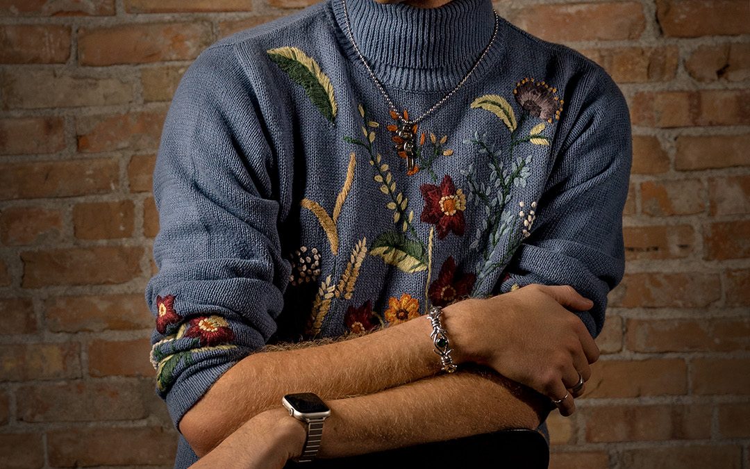
Photography Fine Art Print

Photography Fine Art Print
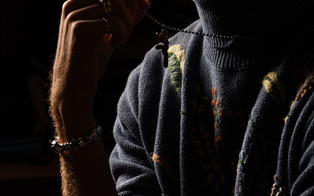
I love my Photography Fine Art Print, I think it really helps showcase some of the skills I have learned in my photography journey. I was able to shoot a ton of different types of photos from landscape to light painting to food and product to portraits for me to decide this one was my favorite. Honestly, this model made taking photos so much fun and he did not disappoint.
My advice for someone who is just learning how to take photos is to practice practice practice. I have learned so many new skills by doing the same thing over and over again until it makes sense. Back at the beginning of September taking photos of people terrified me. And now look at me, I have this large photo hanging up, that I took of another person.
After I chose this photo it took a little bit of editing to make it look exactly how I wanted. I really wanted to darken the brick to give a little bit of a vignette and also to have him stand out more. I also really wanted to show off his sweater so I used the dodge and burn tool. Which by the way has become my favorite tool. Then once we go the prints I was able to choose from a ton of frames to find the one that looked the best with my print. I absolutely love how this turned out. If you end up doing this I want to see them, link your website in the comments!

Check out more Photography Fine Art Prints here

Rental Realtor Photography


Rental Realtor Photography
While staying in Island Park Idaho I was able to try out some rental realtor photography. I learned a lot of things but I am going to share with you all today my best tips. Tip number one use a tripod, especially for inside photos. This might seem weird but you are going to want to bracket all your photos, that way you can get the most detail out of each room. It will be way too dark inside to take good quality bracketed images without a tripod, the handshake would be super noticeable.
Tip number two use a wide-angle lens, you can use a regular kit lens but it will take a lot more images to get the whole room. If you have a wide-angle lens you will be able to capture so much of the room in one photo. Tip number three with rental realtor photography, take photos from each corner of each room, that way you will have at least 4 options to choose from to get the best angle of the room. Also, it isn’t a bad idea to show all angles of a room to potential renters so they can feel like they are in the house without actually being there. Let me know if you have any more questions or want to see how to rent this property for a weekend!


To learn more about Rental Realtor Photography click here